17 Evolutions of Your Favorite Logos
Have you ever wondered how graphic designers created logos before the computer? And how they must’ve drawn them, shipped them, and the company had to replicate a stamp in order to print them?
New technology is part of the reason logos have undergone some dramatic evolutions over the years. But it’s mostly because these companies and their brands have changed over time.
Contents
- Apple Logo Evolution
- Microsoft Logo Evolution
- Yahoo! Logo Evolution
- UPS Logo Evolution
- IBM Logo Evolution
- Xerox Logo Evolution
- Kodak Logo Evolution
- Canon Logo Evolution
- Nokia Logo Evolution
- BP Logo Evolution
- Shell Logo Evolution
- Ford Logo Evolution
- Volkswagen Logo Evolution
- Mercedes-Benz Logo Evolution
- Audi Logo Evolution
- Pepsi Logo Evolution
- Mountain Dew Logo Evolution
- The Point for Young Entrepreneurs
Apple Logo Evolution

The original logo was designed by Steve Jobs and Ronald Wayne and it depicted Isaac Newton sitting under the infamous apple tree. Then, Rob Janoff designed the first rainbow Apple logo with a bite out of it so it wouldn’t be recognized as another fruit.
Microsoft Logo Evolution

The Microsoft employees referred to the “O” in the green logo as “blibbet” and they even had a double cheeseburger in the company cafeteria that was called the “Blibbet Burger”.
Yahoo! Logo Evolution

If you click the “!” in the logo on yahoo.com, it sings, “Yahooo-oo-ooo.”
UPS Logo Evolution

The original logo features an eagle carrying a package with the words, “Safe, Swift, Sure” inscribed on the side.
IBM Logo Evolution
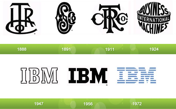
Both the current IBM and the third UPS logo were designed by the same guy, Paul Rand. He also created the logos for Enron, ABC, and Steve Jobs’ NeXT.
Xerox Logo Evolution
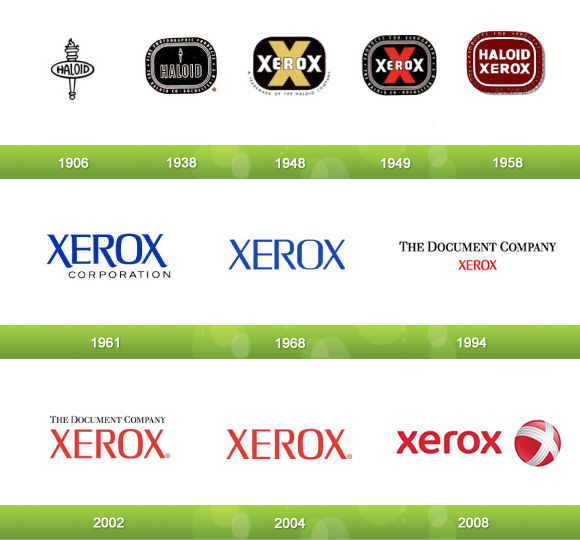
Haloid invested in Chester Carlson’s xerography (aka photocopy) invention in 1938 and it became the most successful division of the company so they switched the name and logo.
Kodak Logo Evolution
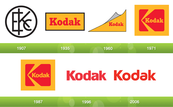
Kodak was originally called “The Eastman Kodak Company,” hence the “EKC” in the original Kodak logo.
Canon Logo Evolution

Their first camera was named, “Kwanon,” after the Buddhist goddess of mercy. The original logo was a picture of this goddess with 1000 arms and flames.
Nokia Logo Evolution

As the oldest original logo in this list, it depicts an image of a fish because Fredrik Idestam founded the company as a wood pulp mill on the banks of the Tammerkoski Rapids.
BP Logo Evolution
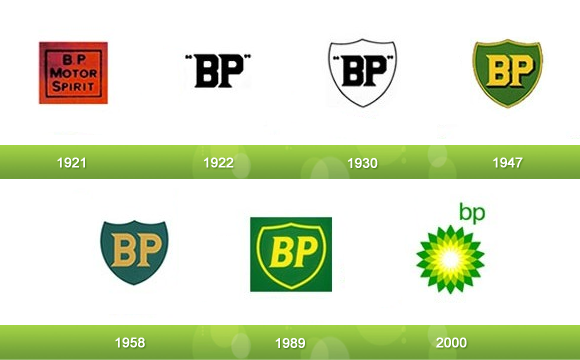
BP’s logo was largely unchanged through its first 80 years until they introduced the Helios symbol in 2000 to represent their commitment to producing energy in all of its many forms.
Shell Logo Evolution
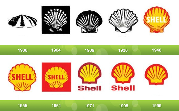
The 1958 BP logo and 1971 Shell logo were designed by the same guy, Raymond Loewy, who also designed the Exxon logo.
Ford Logo Evolution
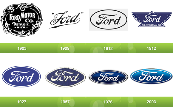
The 1909 logo was created with Childe Harold Wills’ font that he originally developed for his business card.
Volkswagen Logo Evolution

I know what you’re thinking. Why does the original Volkswagen logo slightly resemble the Nazi symbol? Well, that’s because Hitler had a hand in founding the company. Naturally, Volkswagen phased out that part of the logo and stuck with the center.
Mercedes-Benz Logo Evolution
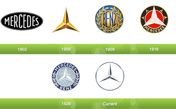
The three pointed star represents their original intent to make vehicles in land, water, and sky.
Audi Logo Evolution
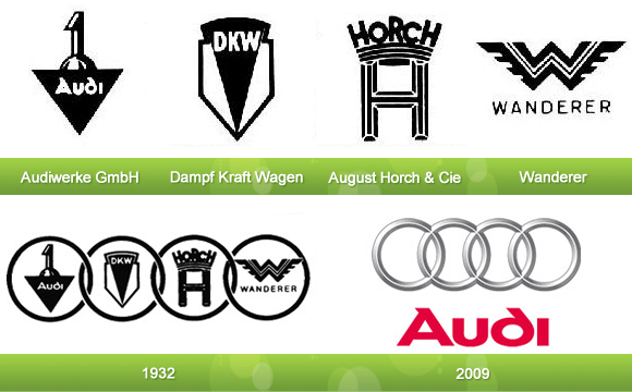
The four circles represent how Audi started as a merger of the four above companies.
Pepsi Logo Evolution
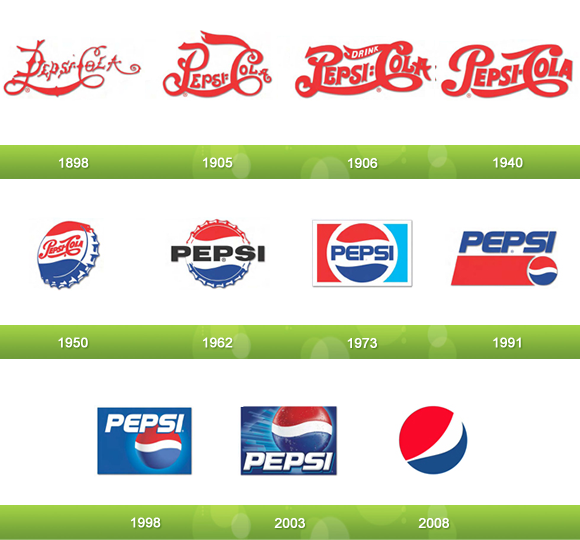
In 1941, Pepsi adopted the colors red, white, and blue to commemorate the war efforts of the United States.
Mountain Dew Logo Evolution

Mountain Dew was originally invented as moonshine by a couple of Tennessee hillbillies with the tagline, “It’ll tickle yore innards!” This is represented in their original logo.
The Point for Young Entrepreneurs
The evolution of these logos is just one way to show that no company is perfect, but the good ones get started and adapt. Heck, five of the 17 companies changed from their original logo within the first year.
Too many young entrepreneurs wait until the planets are aligned to start their business. Don’t let not having a shiny logo get in the way of what’s actually important… You know, getting started.
Comments
"Do Not Write Another Blog Post Until You Watch This Free Video..."

Watch this free video to learn...
- How I got over 10,000,000 people to visit my websites.
- The types of blog post that got me all that traffic.
- How to get someone else to do it for you!


Def. Interesting to look back over time and acknowledge the changes. For better or worse, changes indicate movement and improvement. Thanks for the post
I wonder how much money you can make designing logos.
Good collection of brands.Its nice to see old logos of top brands.
Fun to look at how these logo’s changed over time. Audi’s is exceptionally interesting.
hoping to read the next post. Thanks.
This article is pretty cool, seeing what the company had as a logo years ago and what the have come to today. Awesome write up.
I like the post Nicholas, it’s amazing how far these logos have come along isn’t it? I’d like to see what they will look like in another 50 years from now.
very good and smart
Great piece Nicholas, I see some resemblances to other logos we all know very well. A little inspiration goes a long ways. Your logo is a big part of your brand and getting it right probably won’t happen the first time. Thanks again Nicholas.
Oh, this blog post just fills my old heart with nostalgia. Not that logos are worse or better. I miss the good old days. I’m very educated but poor.
being able to create a good logo doesn’t take much. it sounds very over rated.
I would not have seen the evolution without your pointing it out. Great job. Just goes to show a good brand can tailor their logo as long as they don’t tailor their recipe for success, ie: the beverage itself. I really liked your book, and keep up the good work.
logo is very important, because the logo has become a symbol of the company, the company will not look good if the logo is ugly. thanks and sorry i not yet can speaking english
I find this topic fascinating, marketing is one of the most essential selling points of a product and the way in which these brands have altered their marketing technique through diversification of their logos is certainly a lesson to be learned. The idea is to always maintain a relevant market position. Great work! ((Paid Investor))
Great post again Nicholas The logo is the first chance of a business to make a good impression.. I think you missed of very important business for us internet entrepreneurs ” Google “
This is a very informative article. I just kinda assumed their logos looked the way they are ever since. Anyway, thanks for this article.
Great research Nick…
Good post..
Its amazing the difference between some of the original logos. I’ve got to say the BMW and UPS logos are a couple of my favourites.
Nice work – must have done a lot of research for this article! It’s weird, with some of the logos, I didn’t even realize that it had been changed “recently”… Like Pepsi and and Shell. And most of the old (very older) logos – like Volkswagen and Audi, I have never ever seen before! It’s nice to see the “evolution” of the logos! Thanks! 😀
Supa write up keep it up.
I definitely have to say that i liked the original mercedes and the 1909 mercedes. Looks royal and high class. Mountain dew looks a whole lot better. Audi does also. IBM didn’t change much. I guess they where happy as is.